Designing the logo and visual identity elements for TOM Controll Hungary
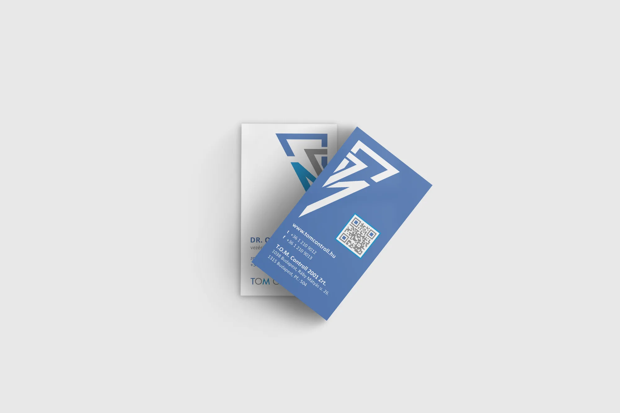
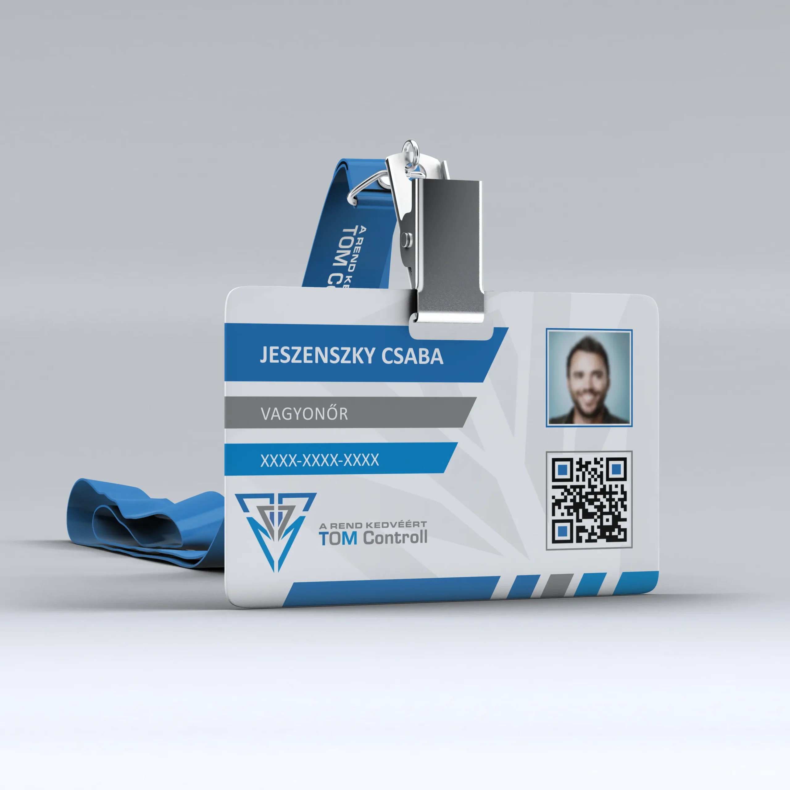
I worked with TOM Controll to redesign their visual identity. The company had been an important character on the security and facility management service providers in Hungary for many years, but their visual elements from the year 2001 did not meet the current technical reproduction requirements, making it challenging for the company to visually express its brand across various mediums. Despite the fact that the company’s employees were present at numerous locations (security employees on public transportations, cleaning service providers at hospitals and large institutions), they were unable to spread the brand through the company’s visual elements.
They felt it was time to develop a modern brand visual experience, because that is where the company had its main disadvantage in the competitivemarket.
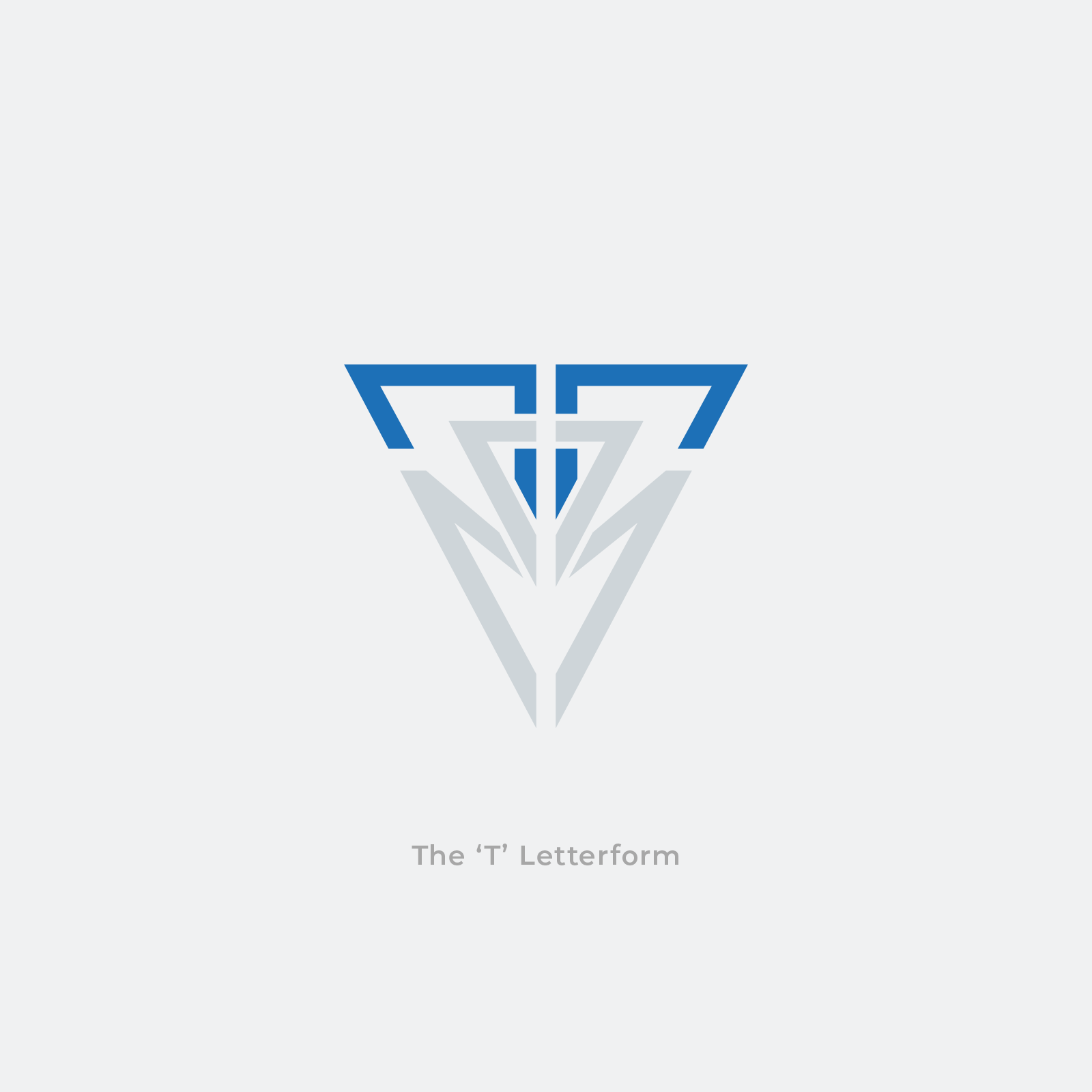
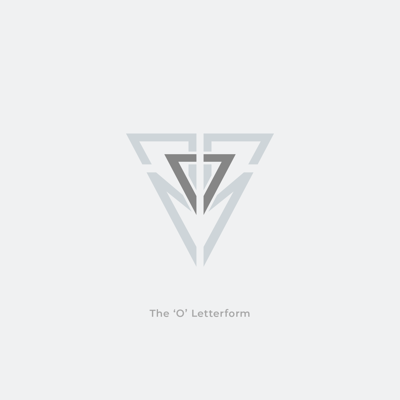
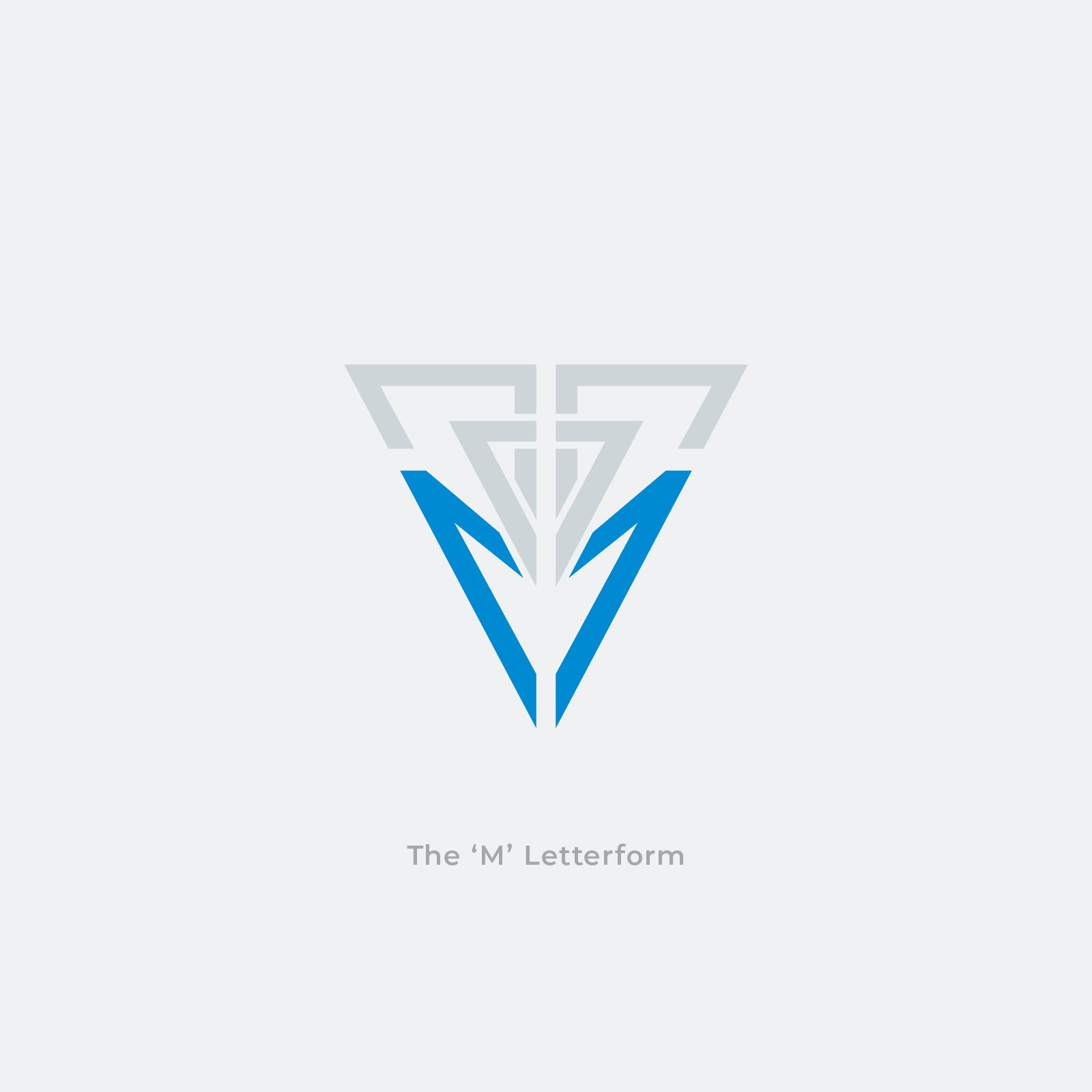
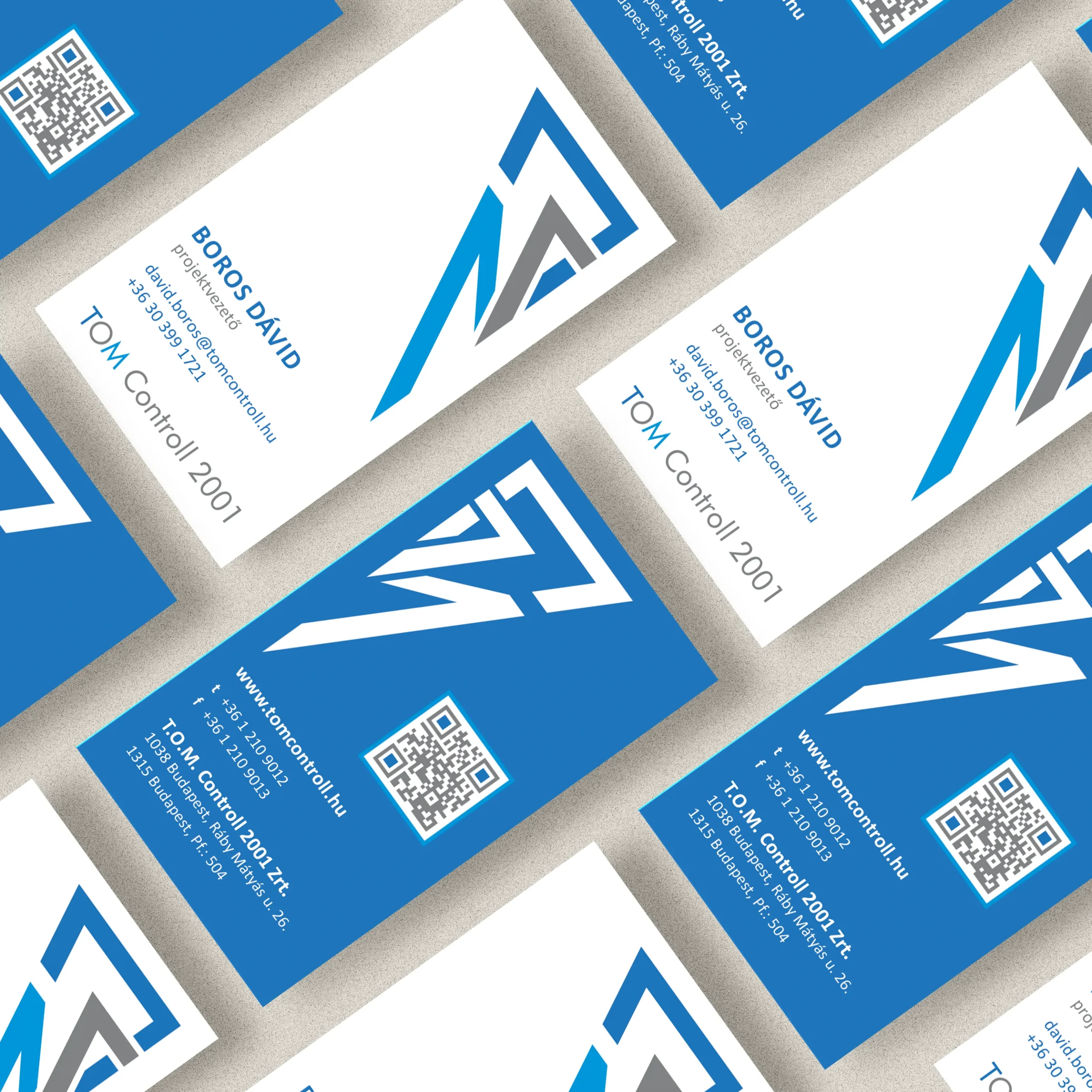
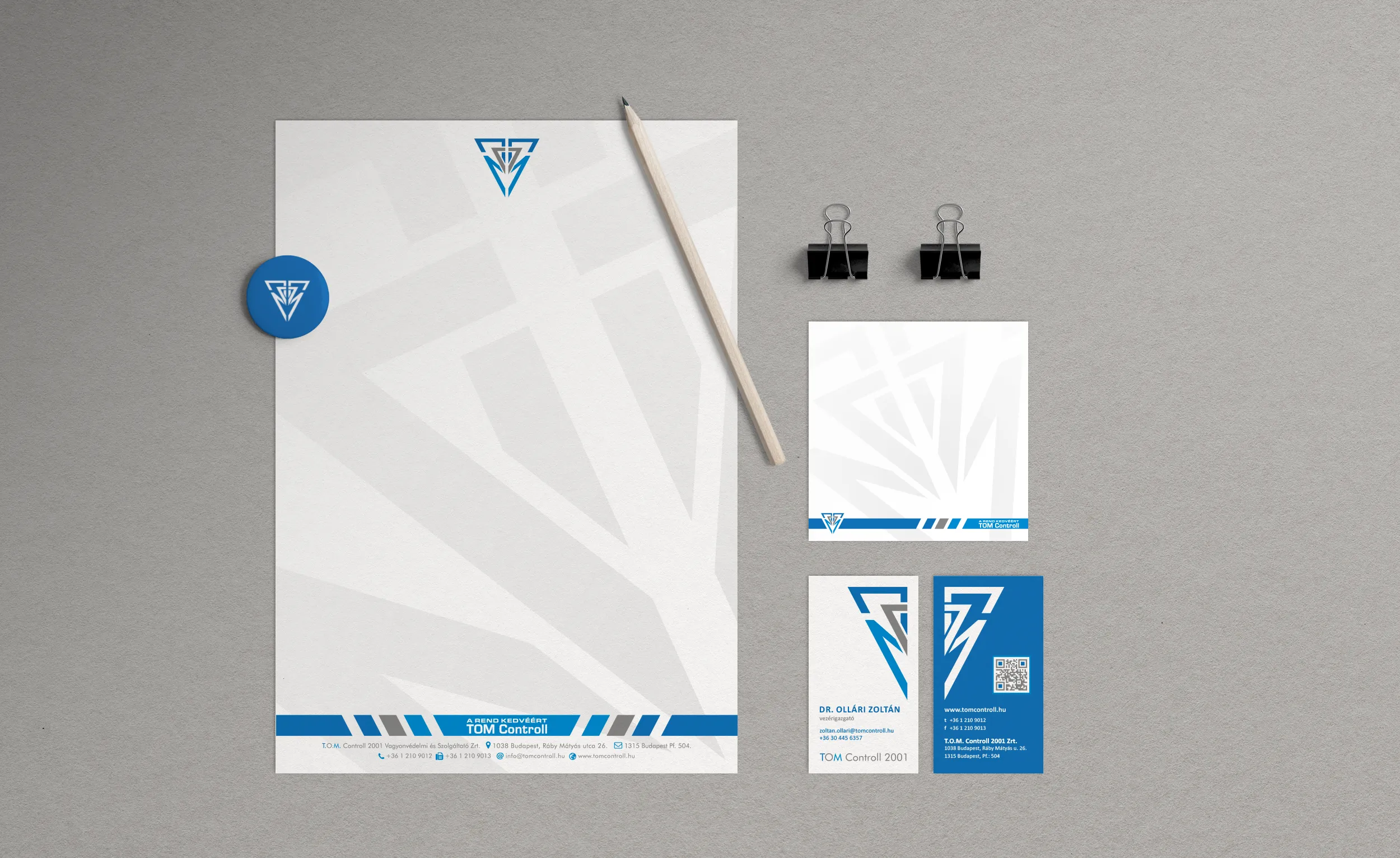
A Shield and The Initials
It was important for TOM Controll to express protection, and what could be more protective than a Shield. But the founders wanted a little twist in the logo, which was to somehow include their initials. With this in mind I draw a logo, which is totally symmetrical, making it easy to develop balanced layouts and display on vehicles. The colors were meant to radiate corporate environment, respect, trustworthiness, while the symmetry should express balance.
Do you like my work?
If you urge for something on this quality level, give us a message and we will get back to you shortly.