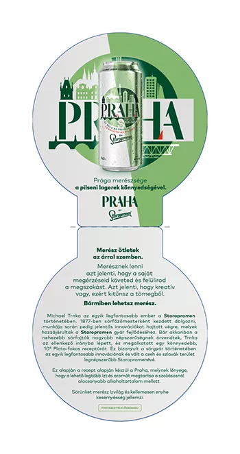
The Staropramen family does not fall behind. This year they introduced a brand new taste mainly targeted for new generations with its bold package design and smooth feeling.
This new beer reflects the creativity and modern spirit of Trnka who, back in 19th century, challenged the traditional brewing techniques in search of full-flavored smooth beer.
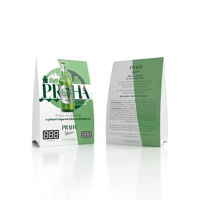
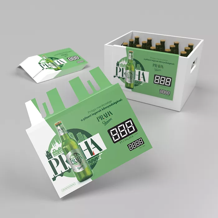
Application of this visual (originally developed by Cocoon Prague) was a breeze, since all the motifs are vector shapes in the design . The bold PRAHA text in center, surrounded by Prague sign motifs like the castle and bridge. The identity of Staropramen only appears in the small white S letter at the bottom middle part, which is very low-key. The bold PRAHA text is very emphasized, reflecting the courageous and creative way of Trnka master brewer.
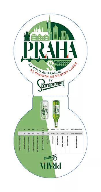
This sales folder with its simple shape focuses on highlighting the round logo. In the introductory phase it was important to provide as many information as possible about this new product, so a background history, a description, product packshots, product specifications and Call-to-Action are all included in this folder.
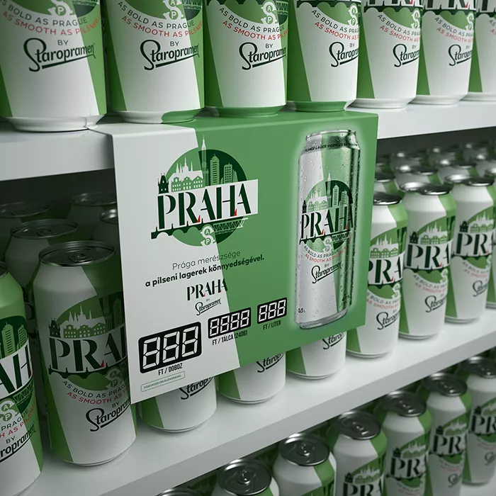
The successful introduction of Praha by Staropramen was risky at this time, because COVID-19 and all its consequences like restrictions and closes of restaurants, pubs were still valid. To point up that this new product is out there, Staropramen built up a solid advertising on TV and print which mainly went to retails. To ensure that the brand-awereness increases after opening the Hotel, Retail and Café (HoReCa) sector, we designed tools to support this sector.
Do you like our work?
If you urge for something on this quality level, give us a message and we will get back to you shortly.