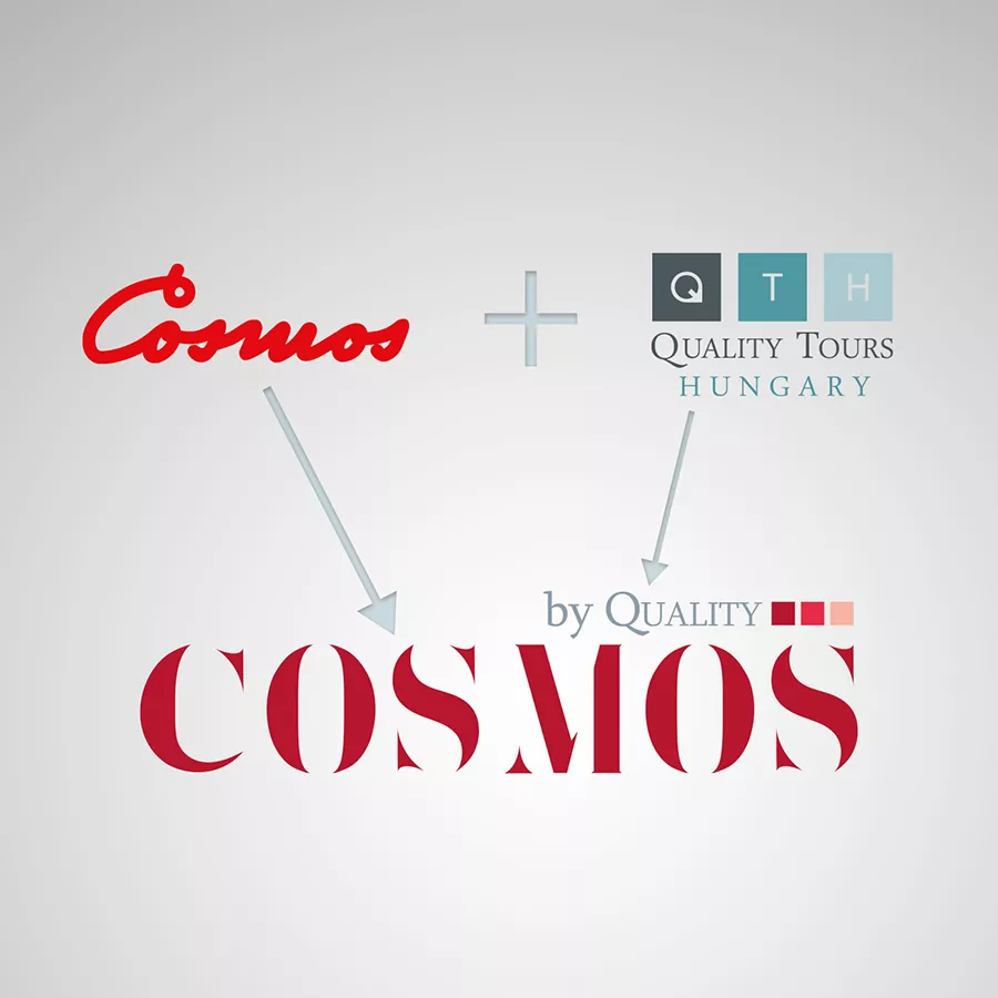
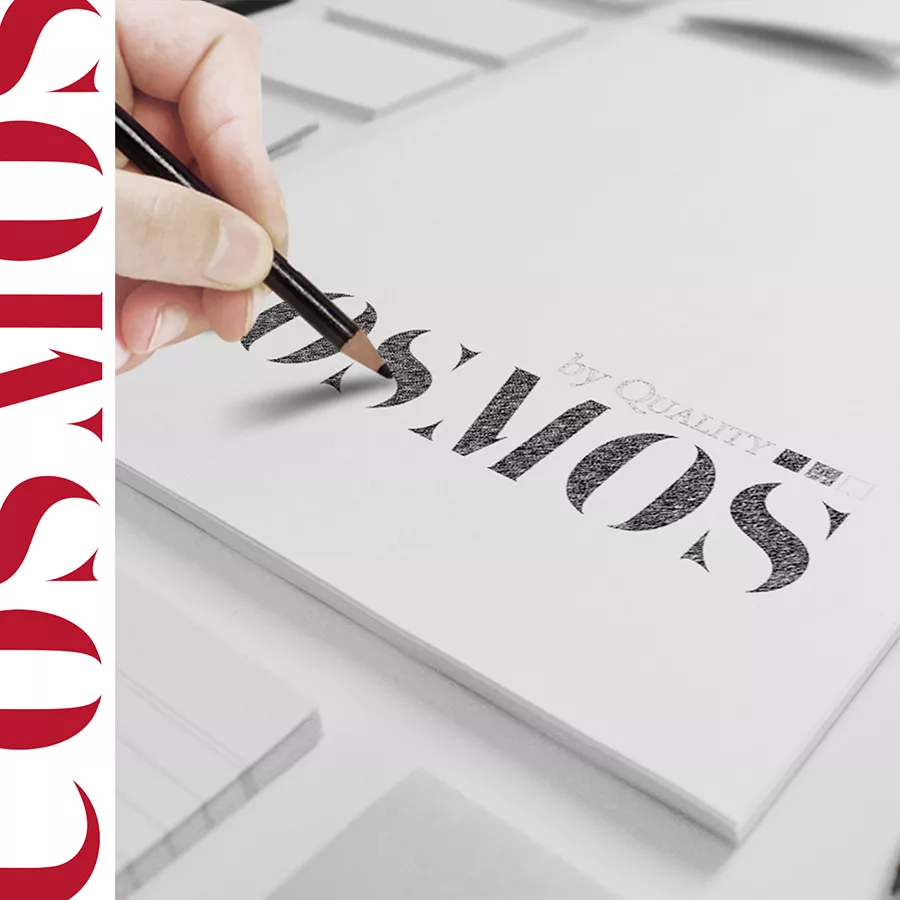
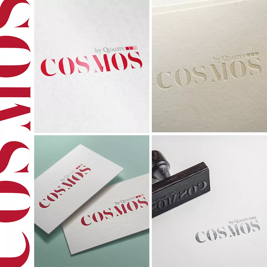
Logo union is always an interesting project. Here we had the opportunity to design an identity for the integration of Quality Tours Hungary into Cosmos. We took a characteristic typeface for Cosmos and simply add the “by Quality Tours” signature above. Simplicity was key, and the basic concept was to emphasize Cosmos since this was the name from then.
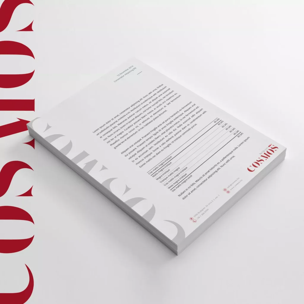
We liked the typeface so much that we used it as a motif with a light grey on the side of the letterhead.
Do you like our work?
If you urge for something on this quality level, give us a message and we will get back to you shortly.