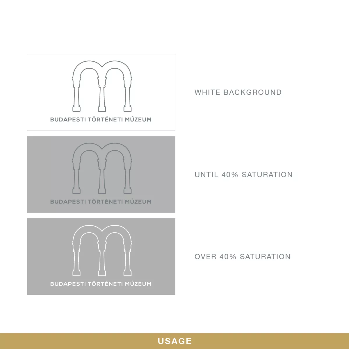
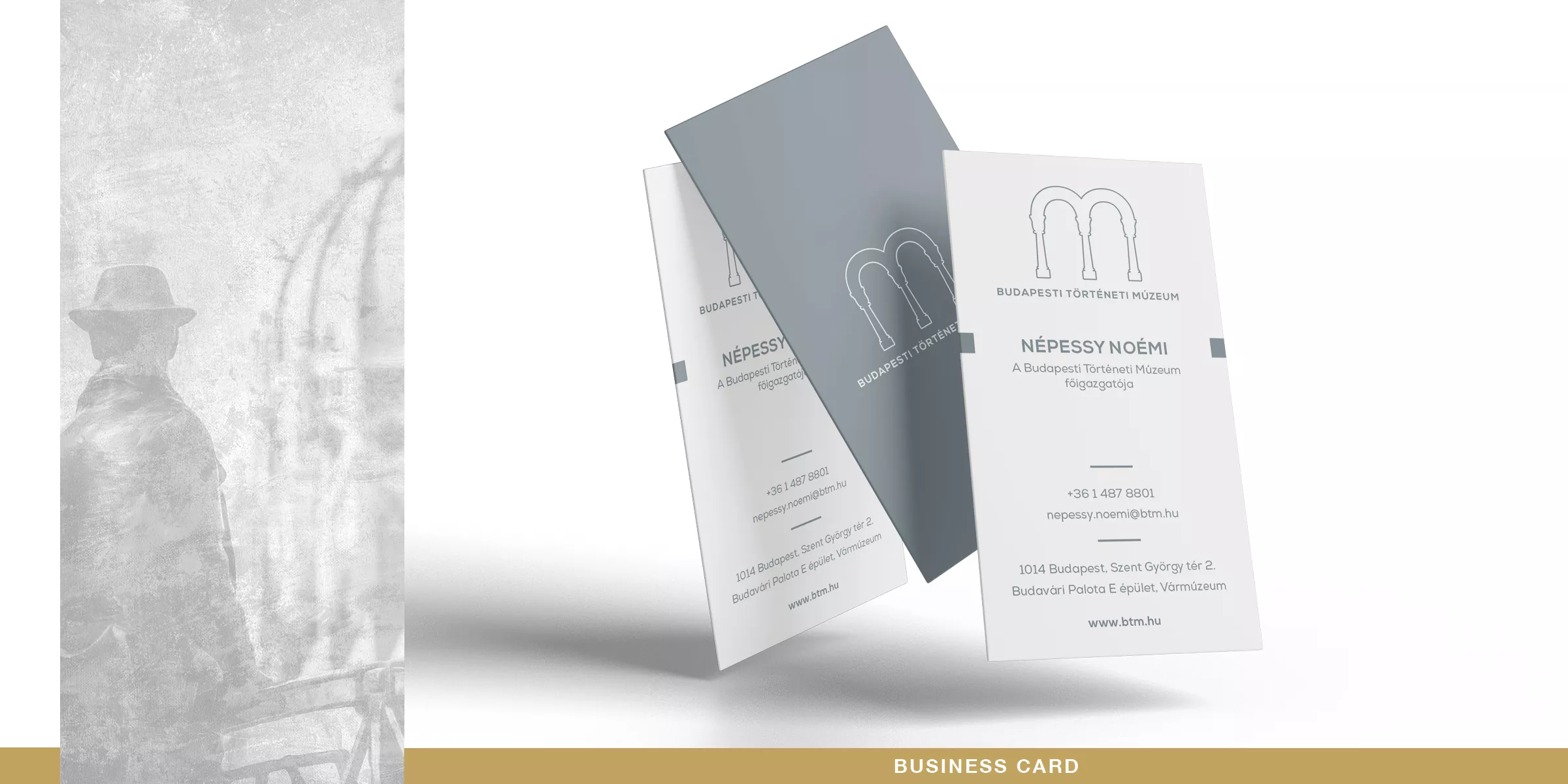
We applied for the Budapest History Museum identity refactoring competition. This museum has 1 main and 4 subbranch in the city, each with its own characteristics and relics. All branches with separate logos, but all logos shall have a connecting motif as it was in the conditions of competition. We chose on of the most iconic place in the Buda Castle (where the museum centre is located) and used its architectural shape to create this logo. Also our goal was to use the M letter referring the museum word. This is how we developed this classic shape with some modern typography.
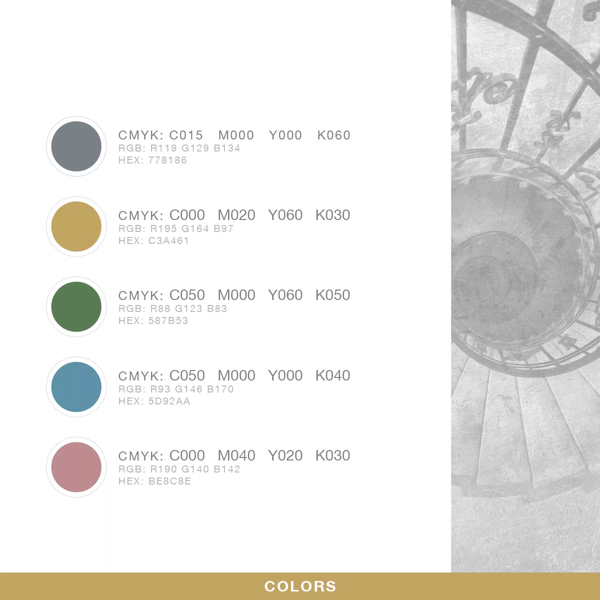
All branch logos can be distinguished by their own color motif and their subtitle. We used soft colors to express an archaic wibe.
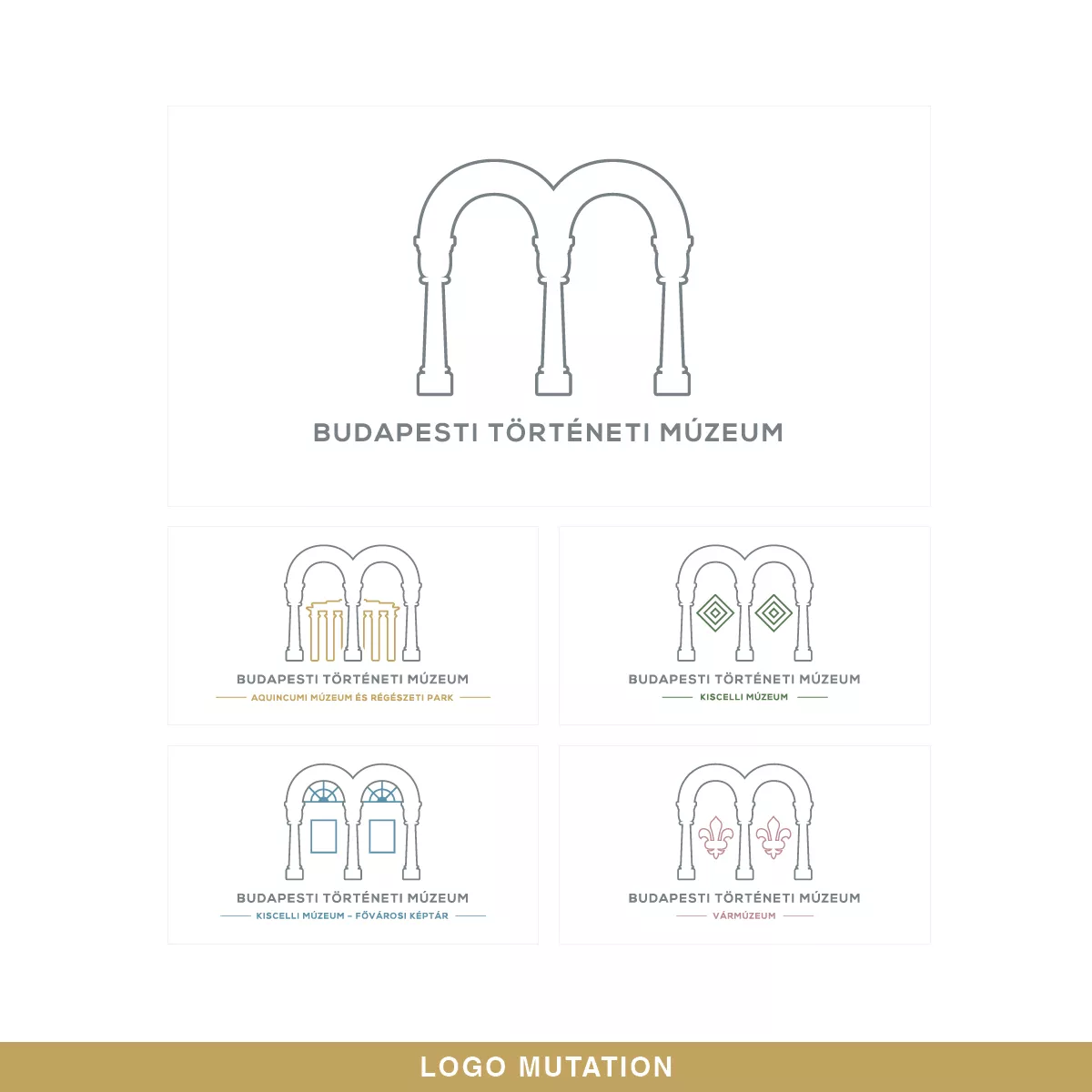
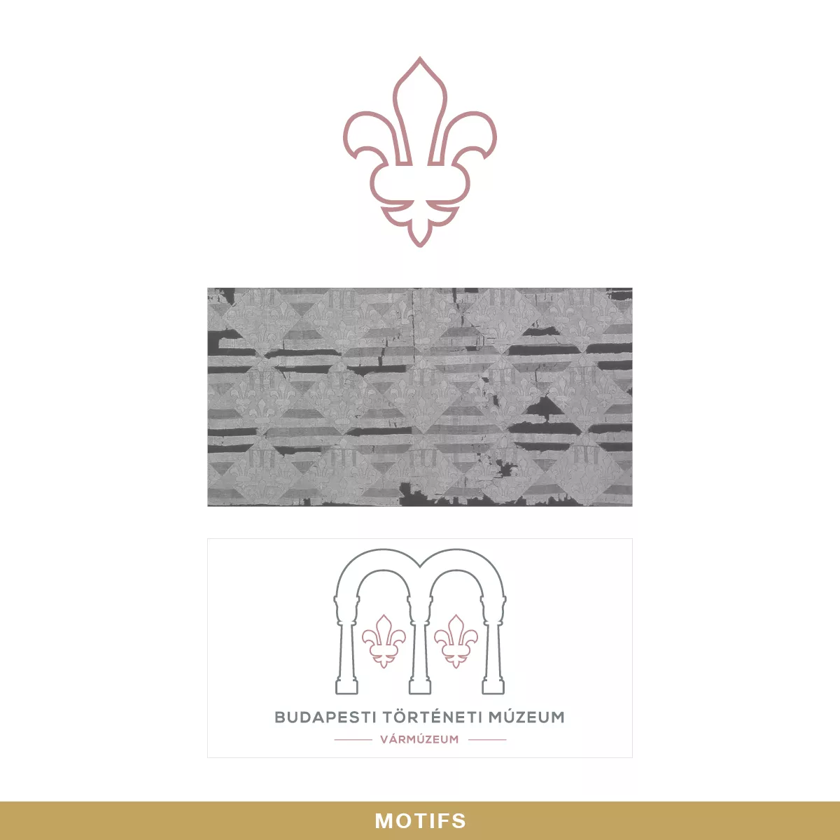
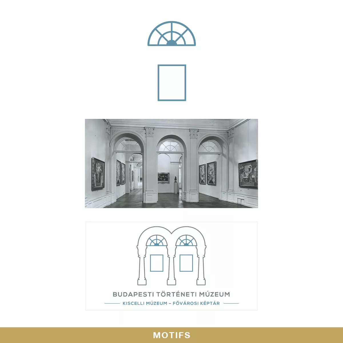
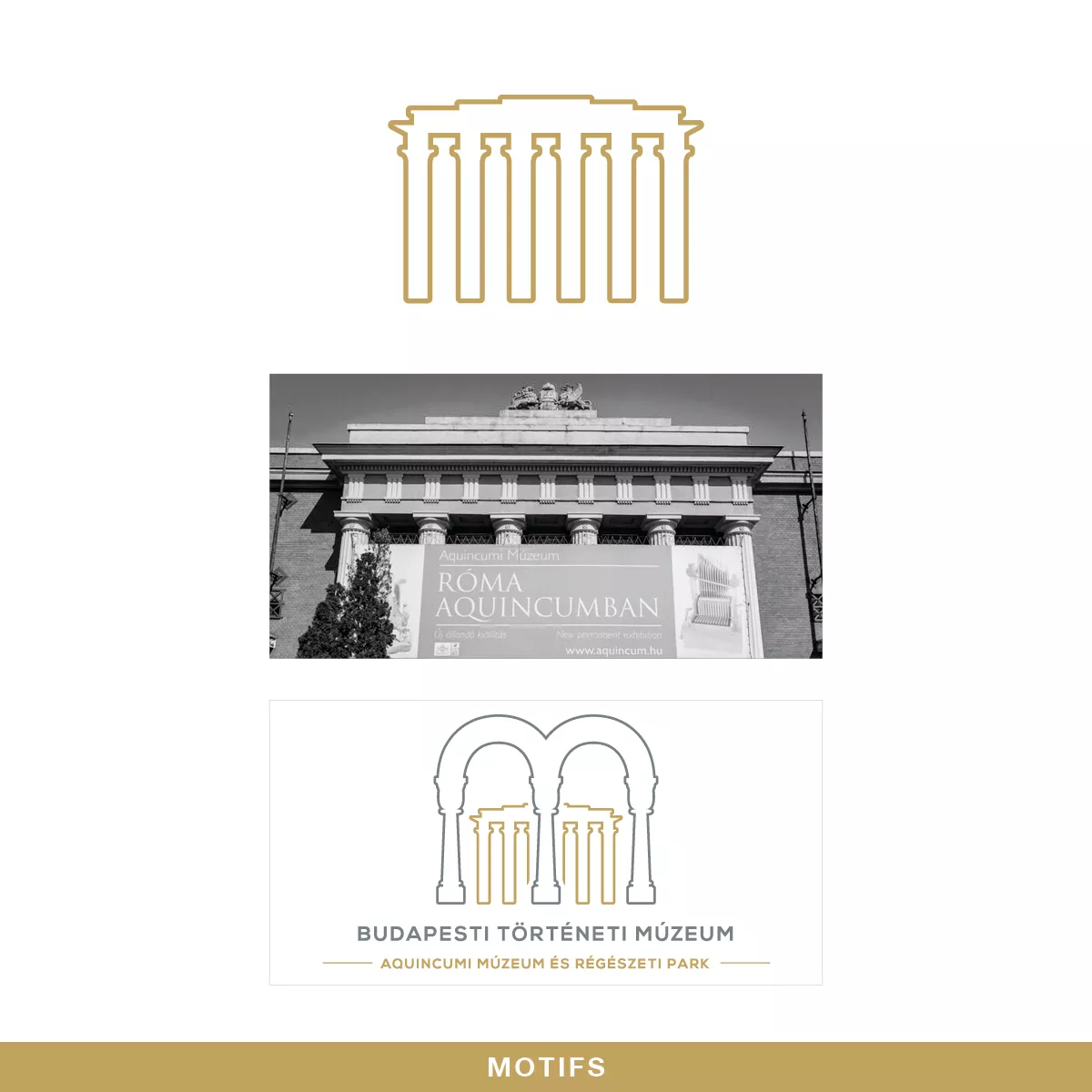
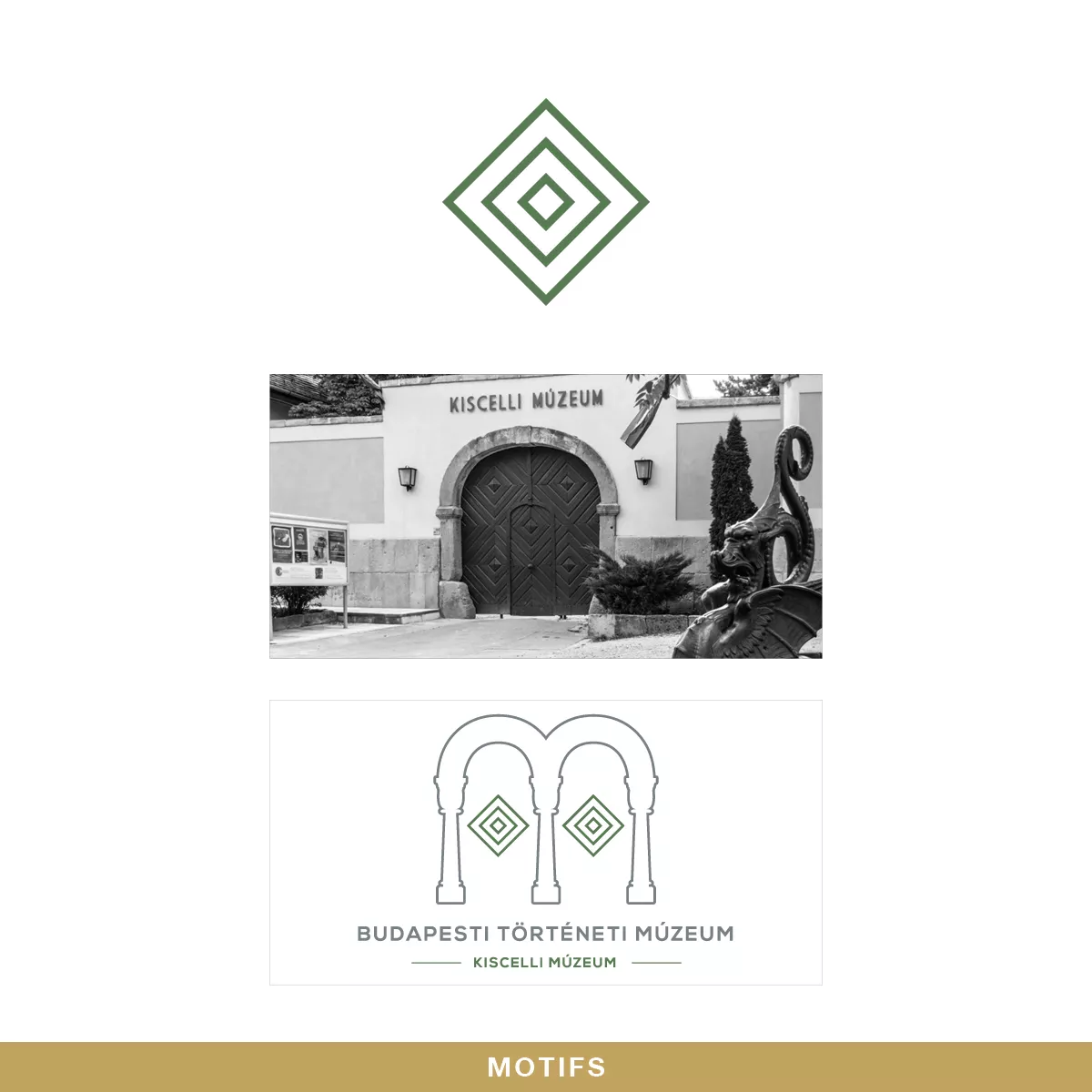
Each division of the Budapest History Museum has some relevant characteristic or motif of its building or relic. We used a motif that we thought can be used the best for the division identity.
These motifs were
the building of the Aquincum Museum branch,
the main entrance door structure of the Kiscelli Museum branch,
the interior column and window structure of the Municipal Gallery,
the flag motif in the Castle Museum
the main logo is referring to the beautiful structure of the Fishermens’ Bastion in the Buda Castle where the Budapest History Museum is located too.
Do you like our work?
If you urge for something on this quality level, give us a message and we will get back to you shortly.