SUCCESSFUL RELAUNCH OF BORSODI BREWERY WITH DELIGHTAD GRAPHIC DESIGN SOLUTIONS
Let us introduce an exciting project which will thrill you if you are a product manager or a marketing team member of an enterprise. Or… if you love to taste quality beer products. We know, it’s always a challenge to launch a new product and even more to relaunch a complete brand. This is what Borsodi Brewery decided and achieved successfully, and we are proud of being a part of this renewal.


About the Borsodi Brewery
If you ever visited Hungary, we are sure you’ve heard the name “Borsodi”. Borsodi Brewery has started operating in 1973 as a member of the Molson Coors Beverage Company and has a determining role in the Hungarian beer culture for nearly 50 years. The brewery is credited with introducing the first alcohol-free beer, the first beer in cans, the first KEG, and the first flavoured beer to the Hungarian market. The company’s goal is not less than impress beer consumers in Hungary and around the world.
It's the Same,
But Also Something New
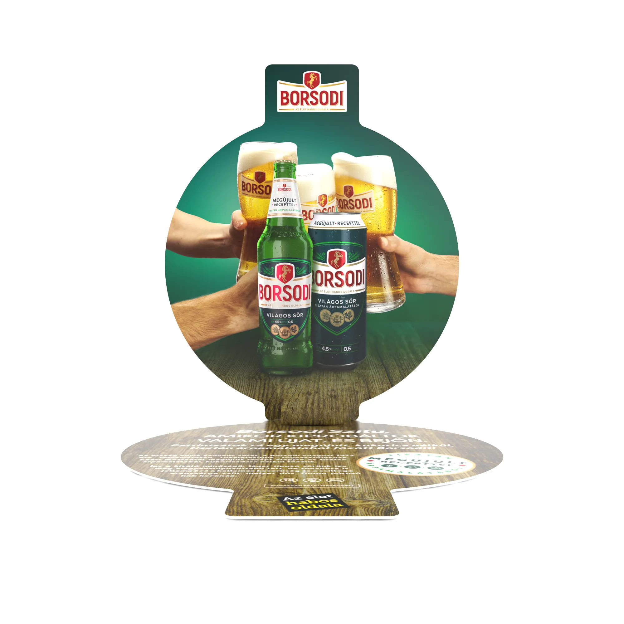
The brewery opened a new chapter in 2019 when they renewed their beer and as a result, they relaunched the Borsodi beer. The new product is special, because it’s made without cornmeal, using only barley malt, hops, yeast and water. They released a more balanced product, which still has a pleasant bitter taste and a shiny golden colour what their consumers ever loved in Borsodi beer.
Pure taste, pure designs: this is the brand-new Borsodi. When you plan to step forward and renew your product, it is hard to find the balance between the original principles and imagine something that moves people. It’s a complex task and you need professional hands to implement all the things perfectly. The new Borsodi is made with pure barely malt, and this is what we were focusing on during the designing process: a clear, unified appearance and how to natively highlight the promotion of the new recipe.
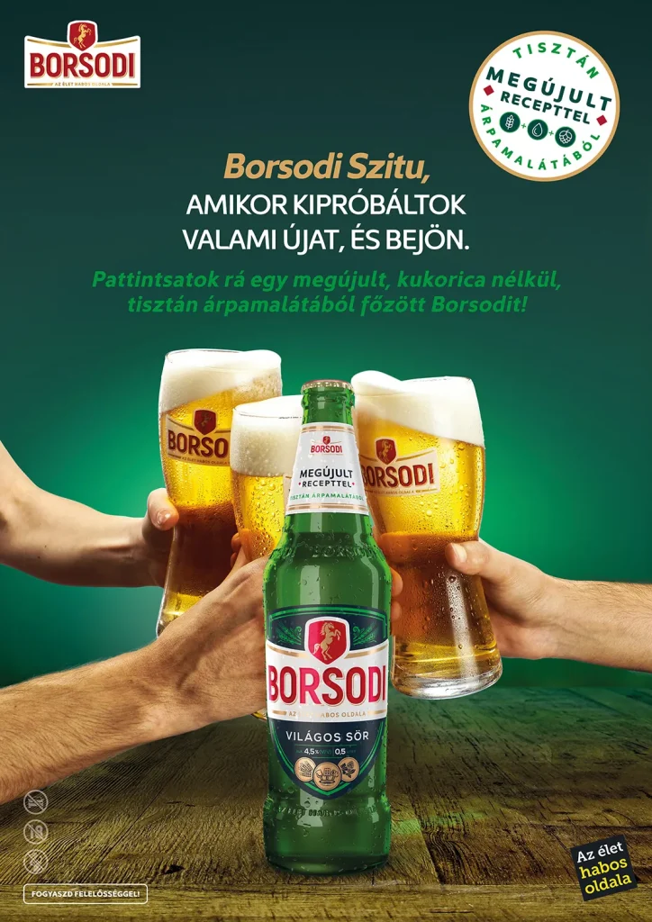
We started with the basics: we’ve got the key visual which means a poster in this case. This poster design has been reworked for different mediums and we created new corporate identity, visuals and packaging for the brewery. We also co-worked with MITO agency which provided the basic visuals and packaging layouts for the project.
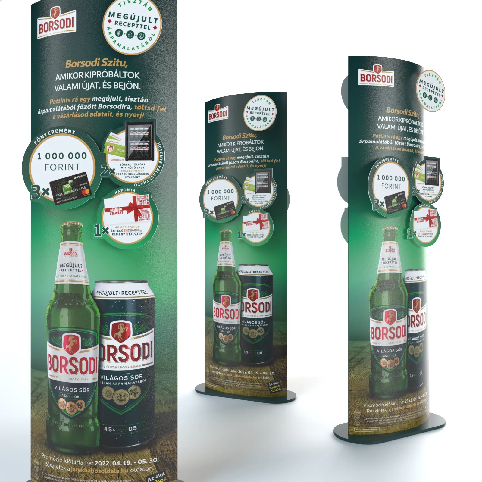
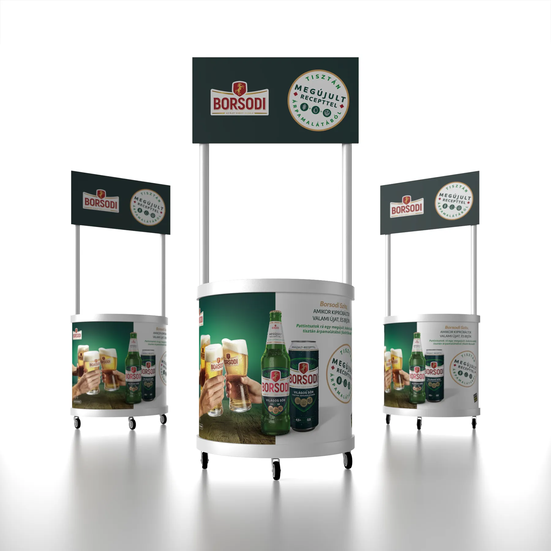
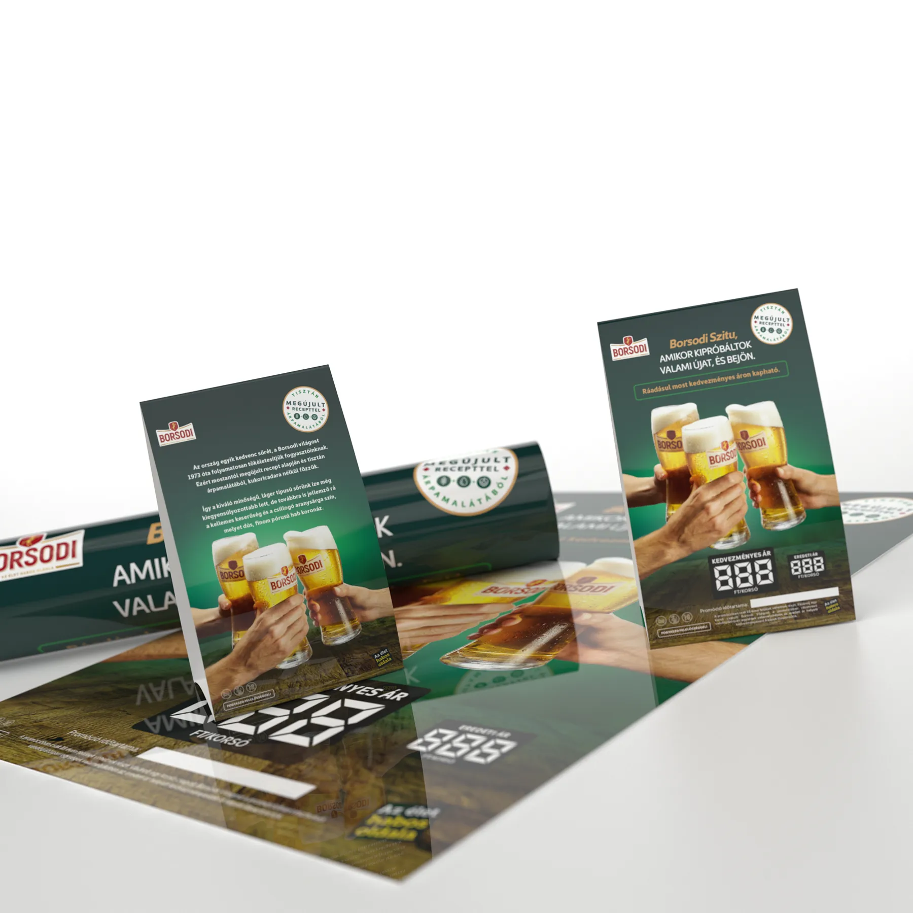
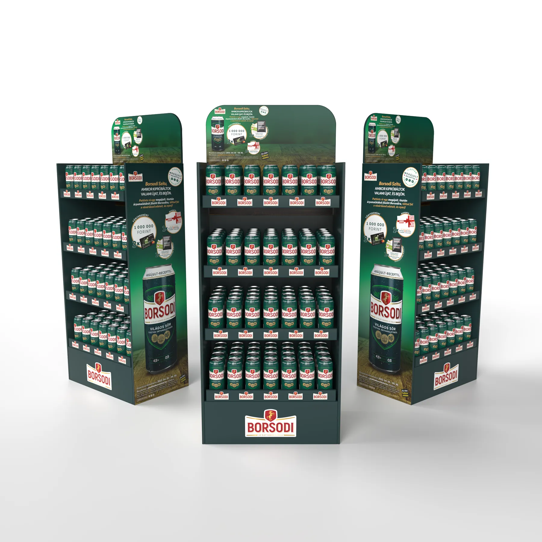
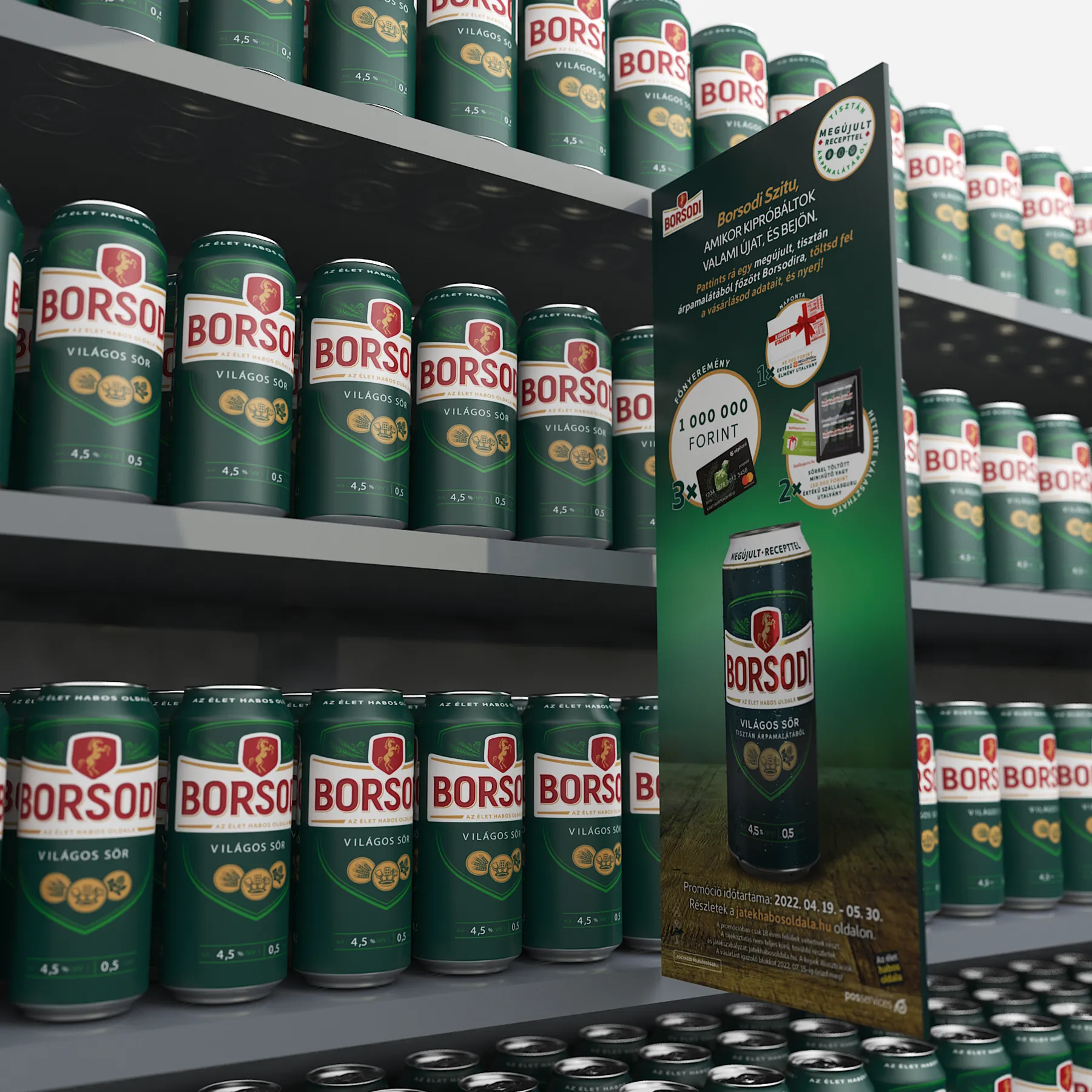
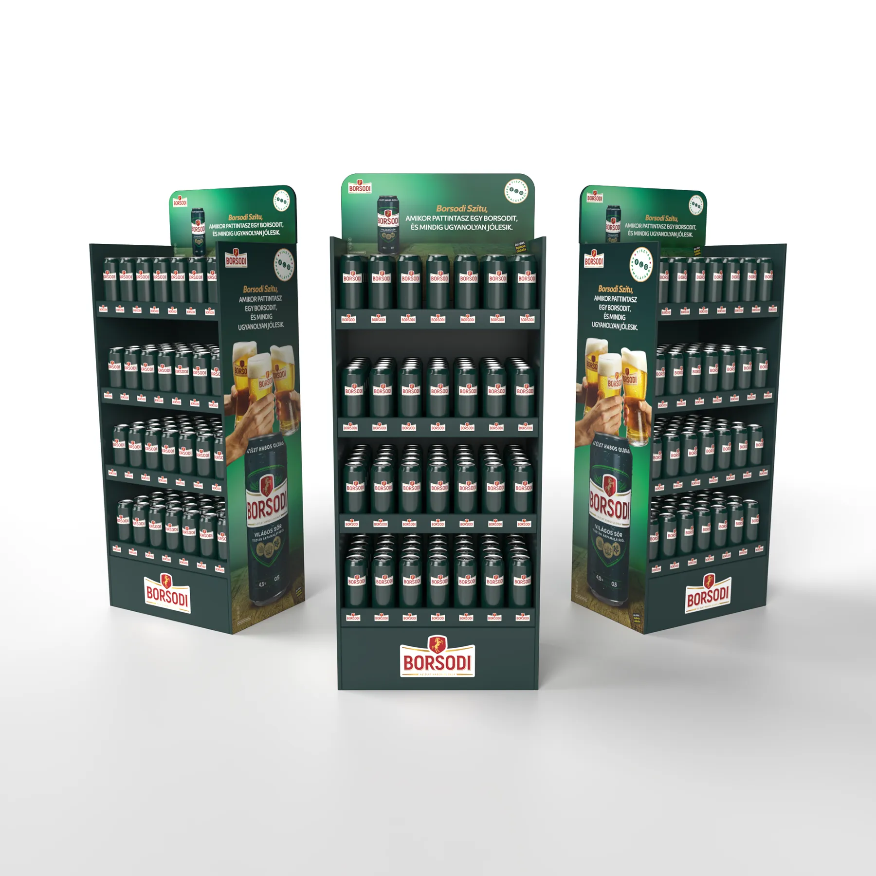
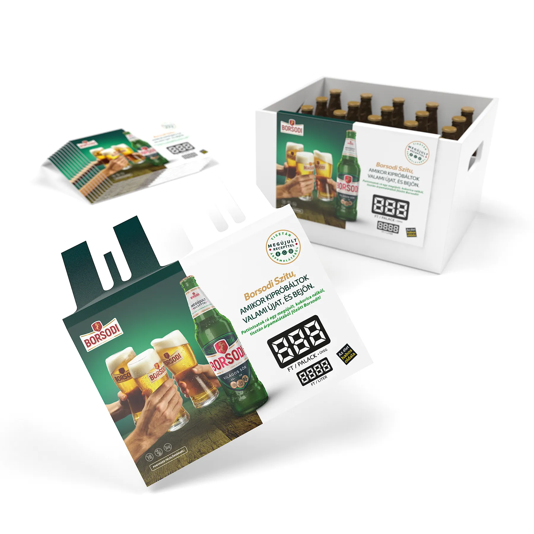
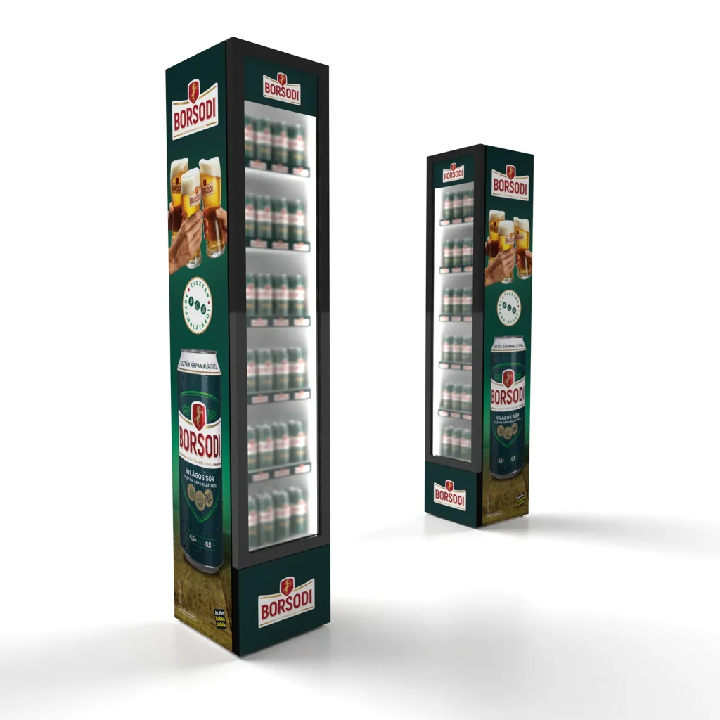
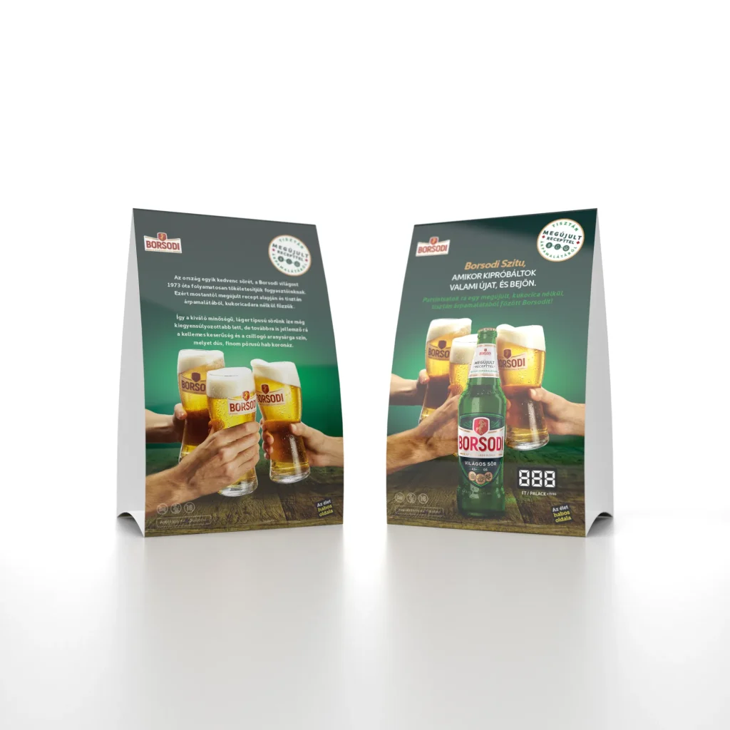
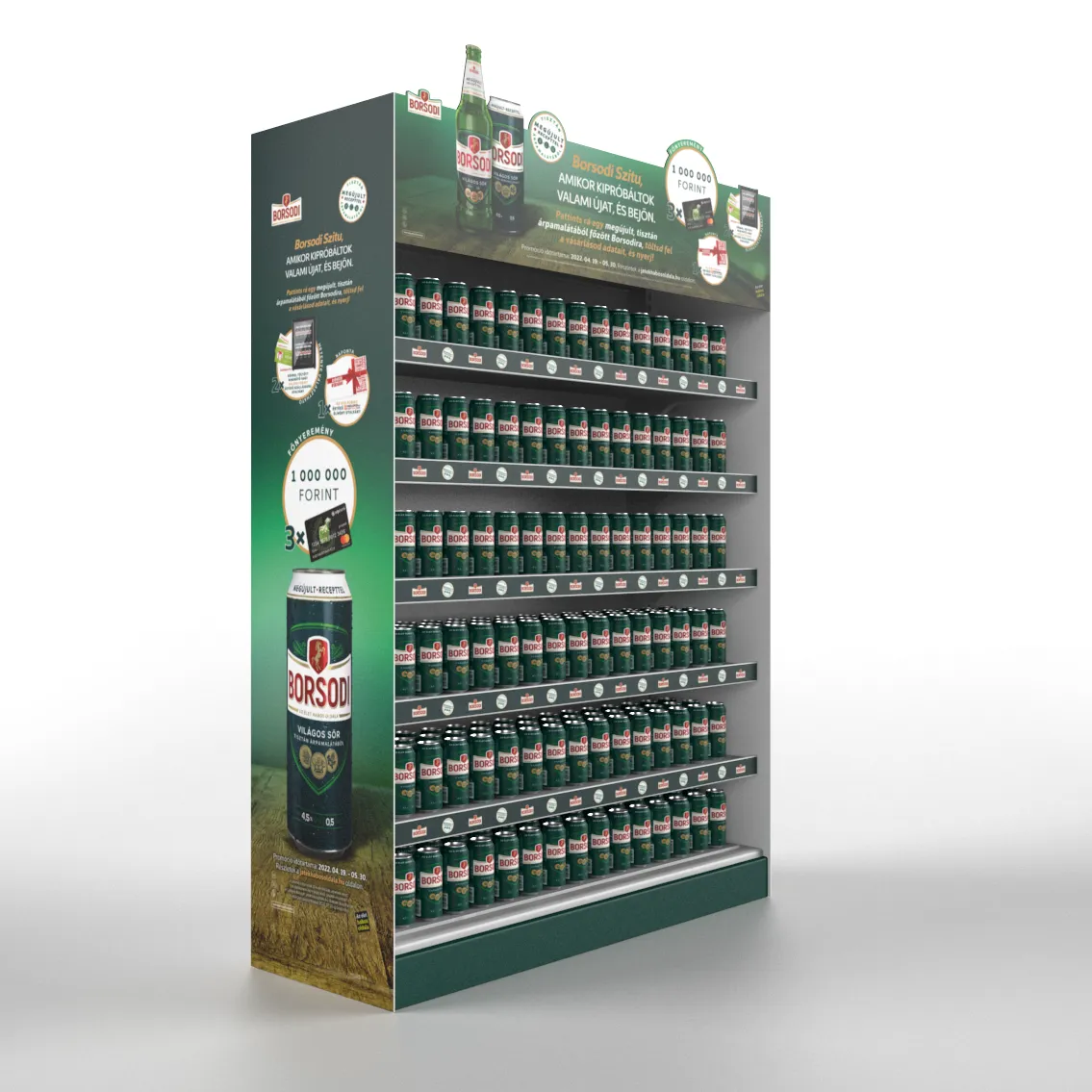
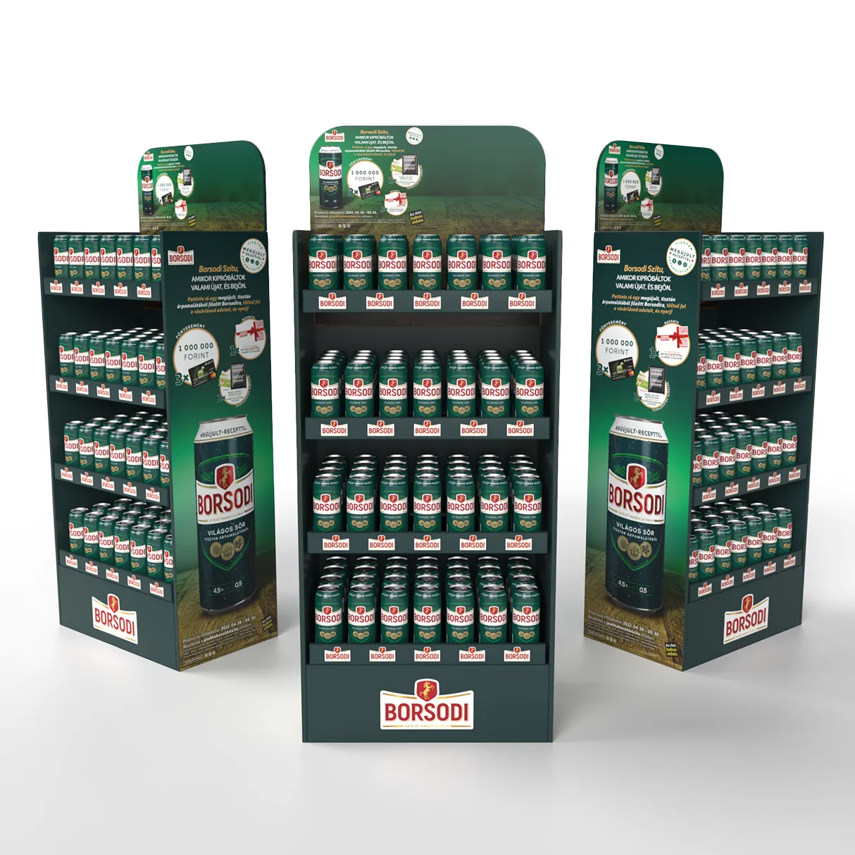
The release was done in two steps, so we had to develop two different versions of sales elements from the key visual which contained basic tools like HORECA, SMALL FOOD and KEY ACCOUNT support tools: poster, price tags, table triangle, display and refrigerator sticker. Also, we designed some elements supporting the launch like Sales Folder (PopUp Brochure), hostess counter and counter paper display. Borsodi even supported the release with promotion, so we created some promotional tools like pallet cover, totem pole, gondola ends, display, floor sticker and Shelftalker.
In the next round – after about 6 months – we had to redesign all the elements focusing on the communication change, because the novelty became a fact. It was no more news that Borsodi recipe contains barely malt, but now it is known for most of the consumers and this knowledge only needed to be strengthened for the public. That meant some minimal changes on the designs, but we had to replace all product images.
Design worth paying attention to
Because of the relaunch was promoted by the brewery, we were responsible to create not a standard design, but we had to place some campaign elements in the first round of the release.
Have you ever felt that the room is too little for you? When you cooperate with different participants on a project, you may have minimal space for ideas. In Borsodi’s campaign a uniform appearance and technical parameters were given so we needed to maximize our opportunities to create something that grabs attention, also which follows the original principles.
Challenge accepted
Despite the tiny space, we’ve done our best and our efforts led the brewery and also us to a successful relaunch. We all know: there is no champion without a challenge. So let’s talk about what we faced during this project and how could we conquer these difficulties.
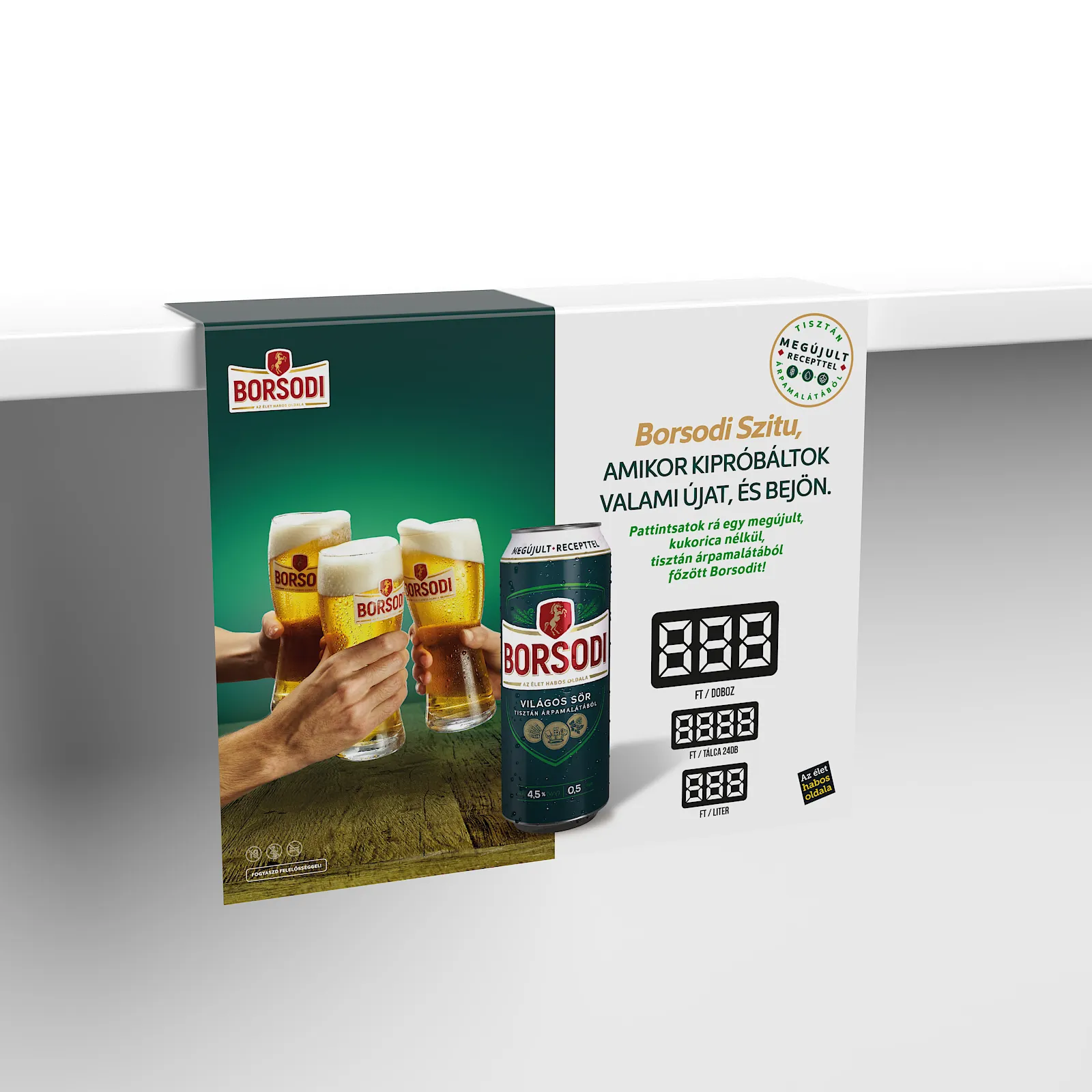
Sales Folder -
our unique development
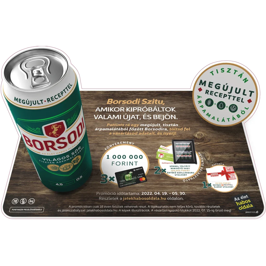
The renewal of the product was very prominent, so we had to come up with something creative to highlight it. So we thought that placing a “Pure Barely Malt” circular badge on every design elements could attract attention. When you open it, you can see the visual with the new packaging and marketing introduction, then if you turn this around, you can find some technical details for the sales department like shelf life, delivery info, etc. The hardest part was to turn the visuals into a 3D experience as much as possible while we provide a design which they can produce cost-effectively.
Totem Pole - made for promotion
Do you like camping? Then you may know the tent type which is promoted as “just drop it and it opens up”. OK, this is the easiest part, but when you plan to move, you may need a 1 hour video tutorial to pack this tent. This is what we tried to avoid with the totem pole. That means, it sounds easy to find a design like this, but it is quite tricky to implement. First, it had to work as a double- sided pole. Next to it, the price was a prominent element, so we had to create a design with an exact background positioning and place the prise as a protruding element on it. The difficulty in this case was that the totem pole should’ve been folded into three and this extra element was glued on the pole instead of placing it afterwards. It means that the prise placement must not cover the fold because in that case it would have jammed when opening. As a part of the promotion “Pure Barely Malt” badge was also highlighted on the top of the totem pole. To summarize, we had to create a pole for the campaign which is attractive and also easy to use.

Gondola ends -
size is the main point
Many stores have different sizes but if you have all the money in the world, that’s not enough to produce it individually everywhere. Our solution: standardize some sizes and apply the design with safety margins, so all stores could adjust the size without losing anything from the graphic composition or quality.
Pallet cover -
a coat for Babylon
We created repetitive graphics, because the number of pallets which can be placed was different in all stores. Next to it, the height of the superstructure differs also, so we had to create a design with special parameters: we left some space free – for example at the bottom – which means we placed no logo or other important information there, this way stores could adjust the size of it. Another interesting part was the box shaped corner element for what we had to apply a unique retouching for printing execution.

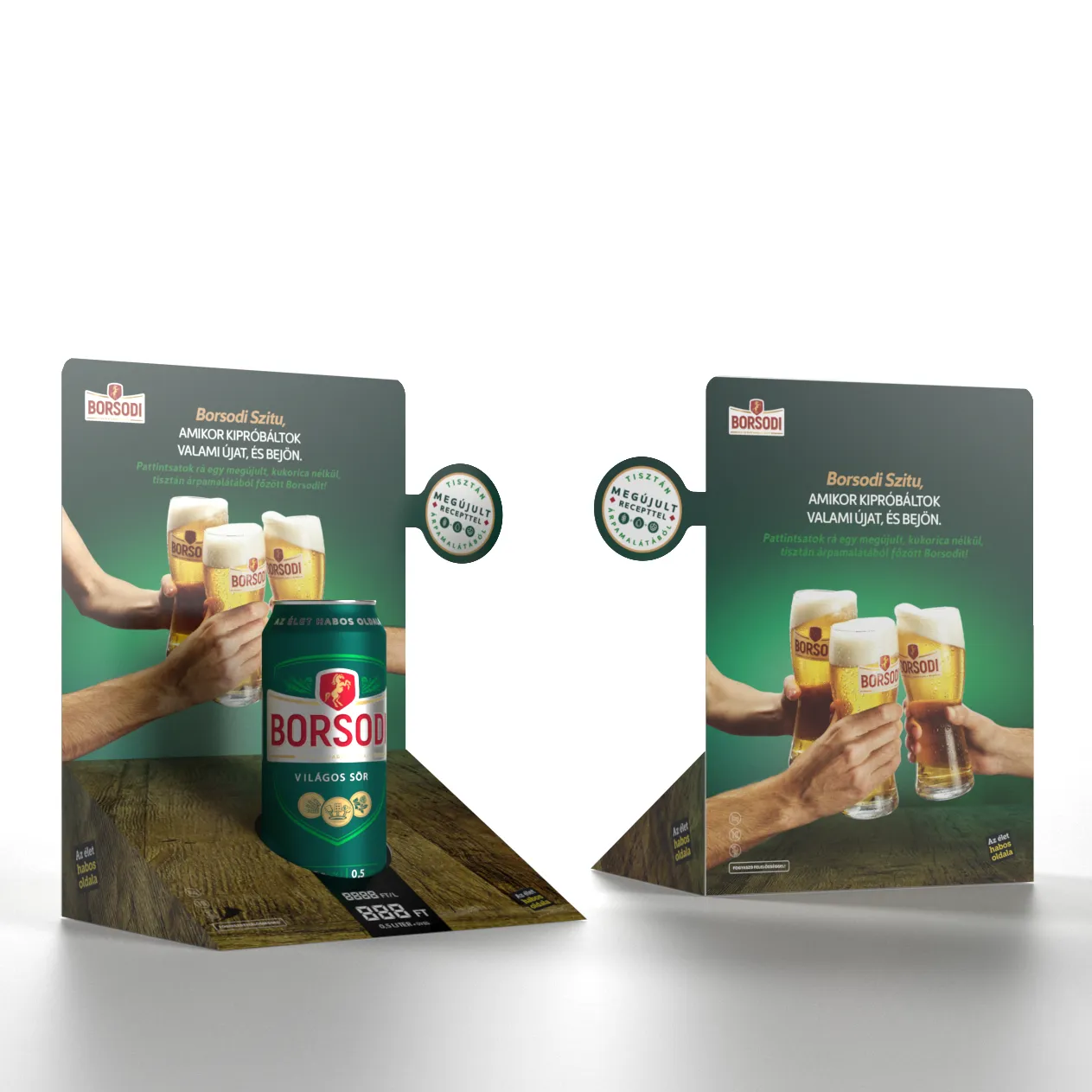
Paper counter display - unique design
presenting 1 or 2 products
This was typically used in Small Food area and was placed at the cash counter in stores. What we tried to achieve with the design is to create a 3D effect where the pedestal that accommodates the price entry field follows the visual and look like this almost continues the motif of the table. Our challenge was to design a unique diecut of the product to manufacture it cost-effectively and quickly as possible. Since it was folded into a sheet, it was an important aspect that it should be easily assembled for the representatives and last for a long time.
Floor sticker -
watch out for your steps!
It was the most funny and enjoyable part of the project. Though it was difficult to create the design, the result looked so fantastic that it was worth to work on it without a doubt! Using the key visual elements, we re-modeled the can and the badge to give a 3D effect to them like the customer would look at the product from above. If you liked any 3D sidewalk chalk arts, then look at this! An amazing campaign tool which makes people’s day while they are shopping in a mall or store – this is what we want with our graphic design solutions, attract people and make shopping more comfortable and entertaining. We had to combine this special design with printing production principles and create a diecut to it focusing on the specific size it had to be displayed in as many places as possible.
Look around,
you'll see our designs everywhere
Borsodi relaunch was successful, the production went well and release were implemented on time. As a result of it, we could increase the impression of the brewery in so many placed throughout Hungary. We were proud that we could create designs which supported our customer and led to success in their renewal.
Do you like my work?
If you urge for something on this quality level, give us a message and we will get back to you shortly.