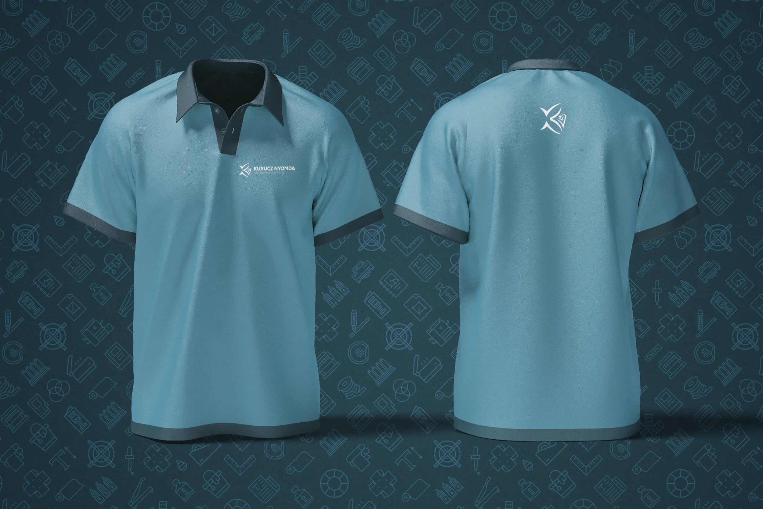
Designing the logo and visual identity elements for Kurucz Nyomda
I used to work at Kurucz Nyomda…in fact, this was the job where my theoretical knowledge of design became practical. Reviewing incoming content every day and evaluating whether a design has printability or quality issues has made me look at design from a different perspective. I learned a lot in those years, and because of that, meeting productivity guidelines and requirements today takes no time.
That is why it was a great honor, when the new owner asked me as a freelancer to update their visual identity to match the new generation, and turn classic into something fresh.
30+ years reformed
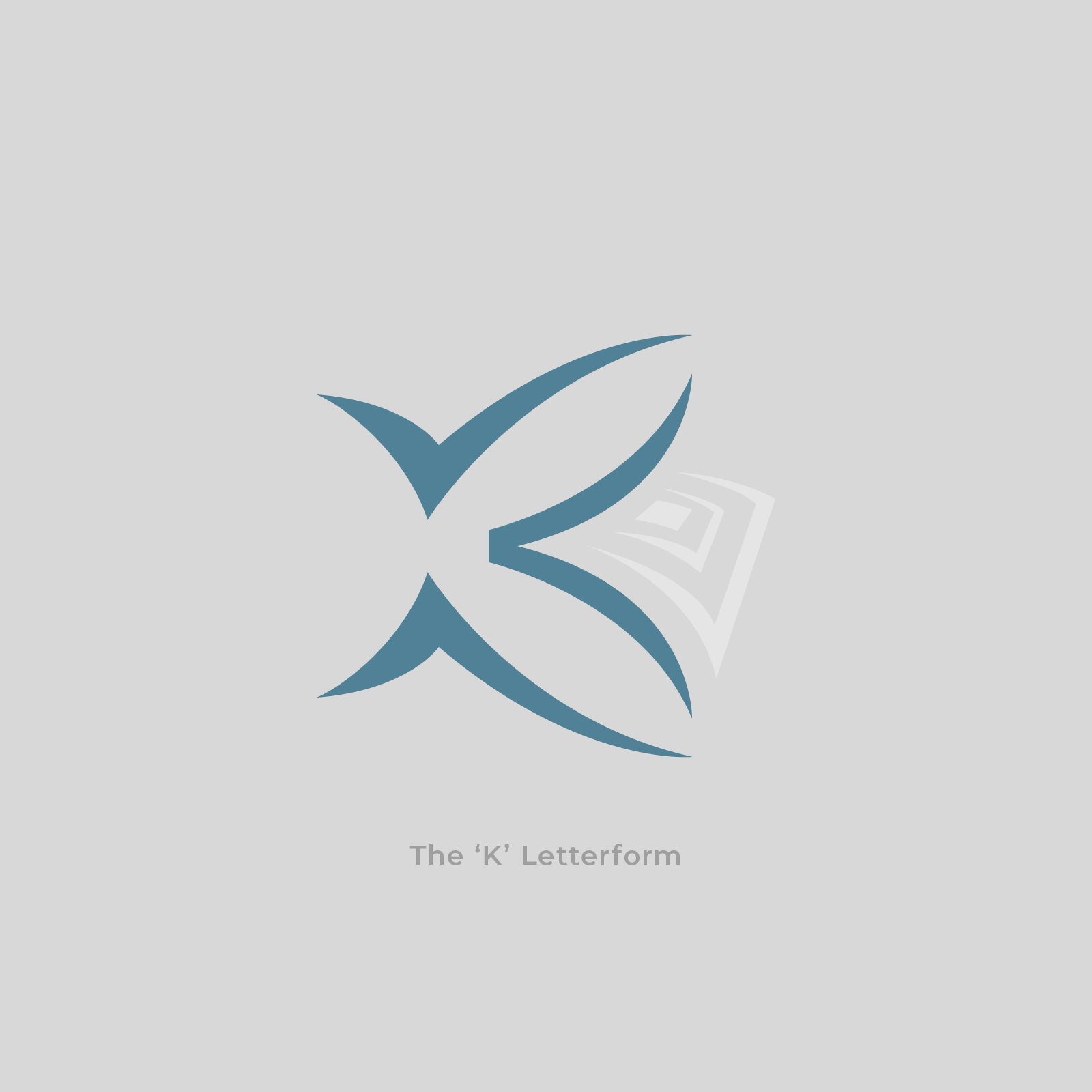
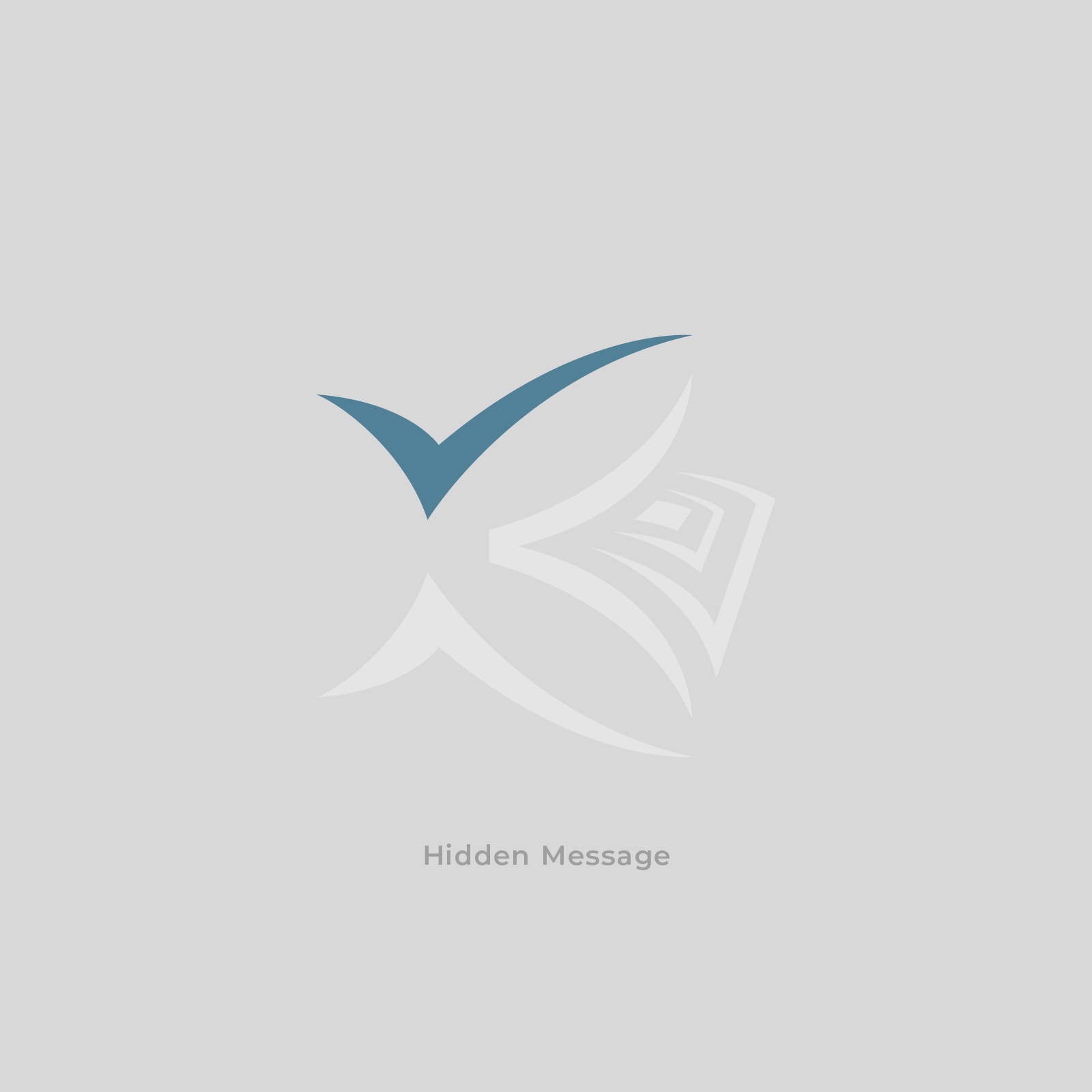
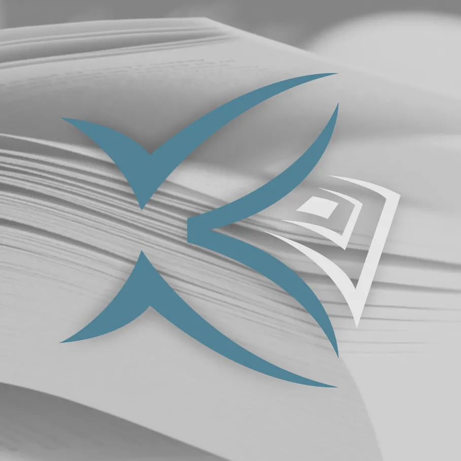
It was important for Kurucz Nyomda to express reliability and stability, but since it’s a family business, they did not want a corporate look. Since the company itself has a 30+ years history at offset printing, and most people identify it with the K letterform, I chose to remain on this path, but reformed it with a small hidden message ‘the Checkmark’ to refer reliability.
Do you like my work?
If you urge for something on this quality level, give us a message and we will get back to you shortly.